The Art of Motown
HIRED BY CHANCE, HELPING TO DESIGN HISTORY
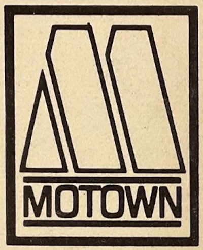
The mighty “M” at the heart of Motown’s corporate logo took its inspiration from an experimental typeface by the name of Futura Black. The identifying “Motown” name below the logo was displayed in Helvetica Bold Condensed, the work of a Swiss typeface designer who introduced it two years before Berry Gordy launched his record company.
The teddy bear shown on the front cover of Martha & the Vandellas’ Come And Get These Memories album was originally ginger in colour, but the designer of the sleeve gave it a blue hue to reflect the mood of the title song. The toy bear was bought from petty cash, and stayed in the designer’s cupboard long afterwards.

That logo, nestling near the Motown Museum
Welcome to the world of design at Motown Records during its formative years, and to the domain of the late Bernard “Bernie” Yeszin, its first art director. The components of his world are captured in the above snapshots, with credit to BandLogoJukeBox, a website devoted to the art of musicians’ logo design, and to Stephen Woods, a Supremes aficionado who interviewed Yeszin the year before his tragic death in 2014. And yes, it was truly tragic – of which more later.
“Usually, they ran the covers by me,” said Barney Ales, the man responsible during the 1960s for selling Motown’s albums (and singles) to the wholesalers and retailers on whom the company’s business depended. “But I didn’t sign off on them.” That, Ales recalled, was the duty of Esther Edwards, who had oversight of the art department. He added that Yeszin was a photographer as well as a designer.
The modesty and relative anonymity of that department came up recently in the second memoir by Al Abrams, Motown’s first publicist. “As an artist, Bernie was unmatched,” wrote Abrams in High On Soul. “His creativity and vision positively impacted and improved everyone and everything he encountered.” The two men shared a small office in the attic of the original Hitsville U.S.A. building on West Grand Boulevard.
Yeszin was born in Detroit on June 15, 1941, attended Mackenzie High School and, later, Wayne State University. An aspiring artist, he was a mere 21 when he paid an unannounced visit to the Motown offices. “I went in, met Berry Gordy and got a job in the art department,” he told Mike Gormley of LA Weekly in 2013. “I didn’t know a thing, really. I just had an eye.” It was 1962.
Within a few days, by Gormley’s account, “the only other guy in the department was gone and Yeszin became the boss.” That exiting individual may or may not have been Barni Wright, who had earned earlier design credits on LPs by Mary Wells, the Marvelettes, Eddie Holland, the Supremes (their debut) and Little Stevie Wonder.
BEIGE WITH ORANGE FLOWERS
Having joined the record company, Yeszin got busy – and the results soon became public. The first project, he told Stephen Woods, was Come And Get These Memories. That was followed by Recorded Live On Stage album sleeves for Wonder, the Miracles and the Marvelettes. Next came Martha & the Vandellas’ Heat Wave, the Miracles’ Doin’ Mickey’s Monkey and Wonder’s With A Song In My Heart, as well as Rev. Martin Luther King’s The Great March To Freedom.
Another name cropped up in design credits from 1963-64: that of painter and graphic artist Wallace Mead. He and Yeszin were name-checked on Christmas With The Miracles, Recorded Live/The Motortown Revue Vol. 2 and releases by Brenda Holloway, Marvin Gaye, Mary Wells and Stevie Wonder; also, the Supremes’ Where Did Our Love Go.
The imagery of the last of those featured the girls in home-made dresses, according to Stephen Woods, which were also deployed on the front of The Supremes Sing Country Western & Pop. “A Woolworth pattern with material from [Detroit department store] Hudson’s, cut out by Mary and sewn by Diane on [her mother] Ernestine’s sewing machine. Bernie told me they were beige with orange flowers, which he eradicated on the album covers.” Subsequently, they became known as the “balloon” dresses, so dubbed by Mary Wilson.

Bernie Yeszin, at work in the attic (photo: OMM Productions)
It was two years after his arrival at Motown that Yeszin designed the unforgettable “M” logo, a visual signature for the music which was forging itself into popular culture. He created a custom typeface, inspired by the Futura and Helvetica sans-serif fonts, and it began appearing on albums from the summer of ’64. The first such use? One candidate is Choker Campbell’s Hits Of The Sixties! issued that August.
The “M” has since endured and become ubiquitous over the past 60 years, including use in the visuals of Motown The Musical when it debuted on Broadway in 2013. And, of course, the Motown Museum in Detroit has tapped into that recognition, as has Universal Music with its many Motown album reissues. Plus, an enterprising, new U.K. independent issued a vinyl compilation of “Northern Soul” favourites by various Motown artists earlier this year – and used an upside down “M” for its own corporate identity: West Grand.
Even so, Al Abrams expressed disappointment in his High On Soul! reminiscences that Yeszin didn’t earn more kudos for his creativity and dedication. “Bernie,” he observed, “was never truly fully appreciated or understood by the rest of the world because he was so far ahead of his time.” That view is underscored by his complete absence in all but a couple of the many Motown books.
Yet it must also be said that much of the company’s album artwork during the early and mid-1960s featured standard images of the artists – although Martha & the Vandellas seemed to inspire a little more imagination on Yeszin’s part. The designers were not always acknowledged, and were often missing, for instance, on Motown’s hits compilations. Nor did the art for Smokey Robinson & the Miracles’ Going To A Go-Go or The Supremes At The Copa earn credit, to single out a couple more examples.
DRIVING IN THE DEAD OF WINTER
In the email exchanges between Abrams and Yeszin which High On Soul reproduces, the latter wrote to the former about the Supremes, “It was I who changed the image of those 3 young girls into the sophisticated lookin’ ladies. It was I who for $5 a night and gas money, sometimes drove “the girls” as you did, to their record hops in the dead of winter of 62 63 64. It was I who put the Temptations in white suits to create the Temptin’ Temps.” He added, “Talk about image, how about the Miracles “Goin’ to a-Go-Go”, what a look.”
Yeszin also recalled, “Those Friday morning meetings in Mr. Gordy’s office were always opened with me presenting my work in progress that week, I set the tone for that meeting, as well as a 1/10 vote on everything to be released.”
In March of 1965, Detroit Free Press journalist Van Gordon Sauter wrote a substantial profile of Motown, having met Yeszin, among many others, at the firm’s offices. “He was a person, already, of great esteem,” Sauter told me recently, “though many in the outfit did not fully grasp his contribution. That was one of the great ironies of Motown. No one knew much about anything beyond their immediate sphere of talent.”
The mighty “M” in its original form
Sauter’s ’65 article was also promoted on the first page of Detroit, the newspaper’s Sunday supplement – with an illustration created by Yeszin. He did something similar for another edition, with a striking photograph of Brenda Holloway.
After four years at Hitsville, the designer opted to leave. It appears that he took on outside projects even while working there, judging by a local classified newspaper ad in October 1964: “Commercial artist. Design album covers.” It included a phone number. “Ask for Mr. Yeszin.”
And so, in the spring of ’66, he segued to Liberty Records in Los Angeles, working in the art department of the Imperial label, and designing a new logo for its R&B imprint, Minit. Other Imperial and Liberty releases which featured his talent included albums by Del Shannon, Sandy Nelson, Bobby Vee and Johnny Rivers; also, the 5th Dimension’s Up, Up & Away on Rivers’ own label, Soul City, while elsewhere, he crafted the Monkees’ Pisces, Aquarius, Capricorn & Jones Ltd. artwork. When his former office buddy, Al Abrams, joined Stax Records, the designer handled several of its assignments.
In the 1970s, Yeszin took his talents into the television industry in Hollywood, working as an art director and graphic designer for various network TV productions, most notably, a sitcom for producer Norman Lear, All That Glitters. He continued in the sector, achieving a peak in 1989 by winning an Emmy award for art direction on The Tracey Ullman Show. In later years, he trained dogs, aiming to place them in movies, but it was a tough field to break into.
High On Soul depicts the difficulties of Yeszin’s final years, when his income was marginal, and he was homeless, living in a van in Los Angeles, sharing it with his beloved golden retriever. Attempts to earn from painting were unsuccessful, and he succumbed to kidney and liver failure on July 8, 2014, at the age of 73.
“The logograph itself, one day, will stand as a 30-story building,” wrote Yeszin about the Motown “M,” in one of his last e-mails to Abrams. “It has personal impact on everyone worldwide.”
Even today, that’s not too much of an exaggeration.